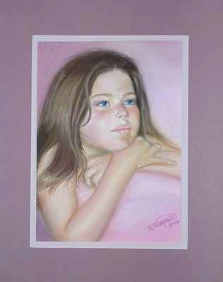
8.5 x 11 Pastel on Mi-Tentes paper
What an exercise in frustration! This was my third attempt at this portrait. I first tried painting it on black wet/dry sandpaper, but the black showed through to the front whenever I blended (on the cheeks, that's not a good thing). Then I tried Wallis sanded paper and had pretty much the same problem even though the backgrournd was gray. I had just about given up in frustration, vowing to go back to oils, but decided to give it one more try. Finally, this one was on creme Mi-Tentes paper. It looks much better in person. For some reason, this one did not photograph well. The shadow under her chin is really not so brown. Well, she likes it anyway, so I guess it's done. Three grandchildren down, two more to go. :)
6 comments:
Hi. It looks beautiful. I think I'm also figuring out on portraits the lighter color papers seem to work better. For my portrait of the boys in the wagon I used a dark blue and got away with it. But with the girls I tossed my 1st portrait on a dark paper because I was not able to get rid of all the darks. I guess if you are really good, and get the pastel laid out in the first couple of passes it would be ok. But I'm definitely not there! I think this portrait has a different quality than your oils and I like it very much. And I'll bet it didn't take you nearly as long as an oil would have- even after 3 tries! My pastels are much faster. What do you think of your pastels?
Beautiful work and beautiful girl! You are so talented!
Tori
Thank you RuthieAnn and Tori!
I'm loving the pastels (except when I'm getting frustrated!) Yes, they are certainly quicker. It took me 30-40 hours to do each of the oil portraits compared to only about 5 hours on Danielle's. And I love not having to take the time to mix paints, then clean all the brushes! (I tend to use a lot of brushes.)
She is lovely. It does take some practice to lay the first pastels down and not have to oaverblend, and you will get there!! The only nit I have is her arm may be a bit too short, but is hard to tell, as she is hunched over the pillow. I don't think is enough to warrent changing, but you wanted any critique...:) Her hair is great, and the skin tones classically portray the look of a young girl. Pat yourself on the back, great job!! Tres
Thank you Tres! Yes, I certainly can handle, and want, critiqe. That's how I learn, and hopefully, become better.
I know what you mean about her arm. It kind of bugged me too, but I've gone over the measurements, etc, and it works out. I thought maybe it's because she is a little chubby in the face, which makes her head look bigger in proportion to her arms. I thought maybe her upper arm was too thin, so I widened it twice, but am still not happy with it. I don't know. I finally gave up. That's one of the things I was talking about when I told you a couple of things still bugged me, but I went ahead and called it done anyway. Now, if I were still working on it (and she didn't already have it), I would just try lengthening her arm off the page more). I should have asked you before I got frustrated and gave up on it. :) Which I intended to do, but somehow didn't get to it.
Thanks for you help, as always. You are a great help. ;) Diane
Diane,
I love it. It's so gentle and caressing. I really like the Seward, Alaska one as well.
You have such talent, and you keep improving on what was already very good.
Post a Comment